Line Charts Trading: How They Look & When They Are Useful

A line chart is the simplest type of chart used in trading, representing the closing prices of a trading instrument over time. It provides a clean and easy-to-understand view of the price movement. Line charts are useful for visualizing the overall trend of a security, as well as identifying key support and resistance levels. They are particularly valuable for reducing market noise and are based on the principle that the closing price determines the true value of the security.
Key Takeaways:
- Line charts are the simplest type of chart used in trading.
- They represent the closing prices of a trading instrument over time.
- Line charts provide a clear view of the price movement and help identify trends.
- They are useful for visualizing support and resistance levels.
- Line charts are effective in reducing market noise.
How to Trade Using Line Charts: Signals and Strategies
Line charts offer valuable insights for traders, enabling them to identify trading signals and develop effective strategies. By leveraging various features of line charts, traders can make informed decisions and maximize their trading potential.
Trendlines and Trend Identification
One of the key elements in line chart analysis is the use of trendlines. Trendlines are drawn on line charts to identify uptrends and downtrends, providing valuable information about the direction of the market. By connecting support and resistance points, traders can easily visualize the trend and make informed trading decisions. Drawing trendlines correctly is crucial, as it can greatly impact the accuracy of the analysis.
In addition to trendlines, line charts are also helpful in visualizing chart patterns. Continuation patterns, such as flags and triangles, can indicate the further continuation of an existing trend, presenting potential opportunities for traders to open positions. Reversal patterns, such as head and shoulders or double tops/bottoms, suggest a potential reversal in the trend, signaling traders to be cautious in their trading decisions.
Complementary Analysis and Indicators
While line charts provide valuable insights, they should be supplemented with other technical indicators for comprehensive analysis. Indicators such as moving averages, Bollinger Bands, or oscillators can provide additional confirmation for trading signals identified on line charts. Combining multiple indicators and analyzing their convergence or divergence can increase the accuracy of trading decisions.
When it comes to line chart strategies, it is important to consider the broader market context and fundamental analysis. Traders should be aware of major news events, economic data releases, or geopolitical developments that may impact the market. This information can help traders avoid potential pitfalls and make more informed trading decisions.
| Line Chart Trading Strategies | Advantages | Disadvantages |
|---|---|---|
| Trendline Breakouts | – Clearly identifies breakout points | – False breakouts can occur |
| Chart Patterns | – Provides visual confirmation of patterns | – Patterns can fail or be subjective |
| Support and Resistance | – Easy identification of key levels | – False breakouts or breakdowns are possible |
“Line charts are a powerful tool for traders to identify trends and trading opportunities. By combining trendlines, chart patterns, and other technical indicators, traders can develop effective strategies and make informed trading decisions.”
While line charts are a valuable tool in trading, it is important to remember that they are just one piece of the puzzle. Traders should consider the limitations of line charts and combine them with other chart types and technical indicators to gain a comprehensive understanding of the market.
Disclaimer: The information provided in this article is for educational purposes only and should not be construed as financial advice. Always conduct your own research and consult with a licensed financial advisor before making any investment decisions.

The Pros and Cons of Line Chart Trading
Line charts offer several advantages that make them popular among traders. Firstly, they are incredibly easy to understand, even for beginners. The simple visualization of the closing prices over time provides a clear picture of the overall trend. Additionally, line charts help reduce market noise by focusing solely on the closing price, which is believed to determine the true value of a security. This clarity allows traders to identify key support and resistance levels with ease, helping them make more informed trading decisions.
Another advantage of line charts is their effectiveness in visualizing the overall trend. By analyzing the slope and direction of the line, traders can quickly determine whether a security is in an uptrend or downtrend. This information is crucial for trend-following strategies and can help traders ride the trend for maximum profitability. Furthermore, line charts are particularly useful in identifying chart patterns, such as double tops, double bottoms, and trend channels. These patterns can signal potential opportunities for traders to enter or exit the market.
Despite their advantages, line charts do have some limitations. One major drawback is the lack of detailed price information. Since line charts only display the closing prices, traders miss out on valuable data such as intraday highs and lows. This limitation can make it challenging to perform precise analysis, especially when considering short-term price fluctuations. Additionally, line charts can generate false signals, particularly on lower time frames, due to their simplicity. To overcome these limitations, it is recommended to complement line charts with other technical indicators and chart types for a more comprehensive analysis.
| Advantages | Disadvantages |
|---|---|
| Easy to understand | Lack of detailed price information |
| Reduces market noise | Potential for false signals |
| Visualizes overall trend | |
| Identifies key support and resistance levels | |
| Useful for identifying chart patterns |
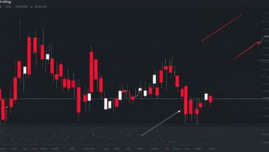
Line Chart Interpretation: Support and Resistance for Scalping
When it comes to scalping strategies, support and resistance levels are key factors to consider. Line charts provide a clear and straightforward way to identify these levels, making them a valuable tool for scalpers.
Support and resistance levels are price levels at which an asset tends to reverse its direction. These levels are determined by previous market highs and lows and can be visualized easily on a line chart. By connecting the relevant swings with a line, traders can identify areas where price has historically found support or resistance.
Line charts make it easy to spot support and resistance levels, enabling scalpers to enter the market at the first sign of rejection in these areas.
When scalping, it is essential to draw support and resistance levels correctly. By using line charts in conjunction with other technical indicators, such as moving averages or oscillators, traders can confirm potential entry points and increase the probability of successful trades.
Table: Example of Support and Resistance Levels
| Date | Support Level | Resistance Level |
|---|---|---|
| January 1, 2022 | 100.00 | 105.00 |
| January 2, 2022 | 102.50 | 107.50 |
| January 3, 2022 | 101.00 | 106.00 |
By analyzing support and resistance levels on line charts, scalpers can anticipate potential price movements and adjust their trading strategies accordingly. However, it is essential to remember that support and resistance levels are not fixed and can shift over time as market dynamics change.
In conclusion, line charts provide scalpers with a straightforward and effective way to interpret support and resistance levels. By combining line charts with other technical indicators and conducting thorough analysis, scalpers can increase their chances of success in volatile markets.
Line Charts for Swing Trading: Identifying Trends and Key Levels
In swing trading, traders aim to capture larger price movements over a longer period of time. Line charts can be an effective tool for identifying trends and key levels in swing trading strategies. By analyzing the price action over a significant timeframe, swing traders can spot accurate support and resistance levels that may not be visible on other types of charts, such as bar charts or candlestick charts.
The simplicity of line charts makes it easy for traders to identify trends and visualize price movements. By connecting the closing prices over time, line charts provide a clear representation of the overall trend. Traders can easily spot whether the price is moving up or down, helping them make informed decisions.
Furthermore, line charts can help identify key support and resistance levels, which are crucial for swing trading strategies. These levels represent areas where the price has historically paused or reversed, indicating potential turning points in the market. By accurately identifying these levels, traders can set entry and exit points for their swing trades, increasing the probability of success.
| Advantages of Line Charts for Swing Trading | Limitations of Line Charts for Swing Trading |
|---|---|
|
|
Line Chart Patterns and Breakouts
Line charts are a valuable tool for traders to identify various chart patterns and potential breakouts in the market. By studying these patterns, traders can develop effective strategies based on the signals provided by the line chart. Understanding these patterns is essential for making informed trading decisions and maximizing profit potential.
Continuation Patterns
Continuation patterns are chart patterns that suggest a temporary pause in the ongoing trend, followed by a continuation in the same direction. One commonly observed continuation pattern on line charts is the ascending triangle. This pattern is characterized by a horizontal resistance line and an upward-sloping support line. When the price breaks above the resistance line, it confirms the continuation of the uptrend. Traders can then enter a long position and set a target price based on the pattern’s projected move.
Reversal Patterns
Reversal patterns on line charts indicate a potential change in the direction of the prevailing trend. One example of a reversal pattern is the head and shoulders pattern. This pattern consists of three peaks, with the middle peak (the head) higher than the other two (the shoulders). When the price breaks below the neckline, which connects the lows of the shoulders, it signals a potential trend reversal. Traders can then enter a short position and set a target price based on the pattern’s projected move.
| Pattern | Description | Signal |
|---|---|---|
| Ascending Triangle | Horizontal resistance line and upward-sloping support line | Breakout above resistance line confirms uptrend continuation |
| Head and Shoulders | Three peaks with the middle peak higher than the other two | Breakout below neckline confirms trend reversal |
| Descending Triangle | Horizontal support line and downward-sloping resistance line | Breakout below support line confirms downtrend continuation |
Other Patterns
In addition to continuation and reversal patterns, line charts can also reveal other chart patterns such as double tops and bottoms, symmetrical triangles, and flags. These patterns can provide valuable insights into market dynamics and help traders make more accurate predictions about future price movements. It is important to note that line charts should be used in conjunction with other technical indicators and analysis tools to confirm the validity of these patterns and minimize the risk of false signals.
By understanding line chart patterns and breakouts, traders can develop effective trading strategies and capitalize on profitable opportunities in the market. It is essential to continuously study and analyze these patterns to stay ahead of market trends and make informed trading decisions.

| Line Charts | Candlestick Charts | Bar Charts | Renko Charts | |
|---|---|---|---|---|
| Advantages | Easy to understand Reduces market noise Visualizes overall trend Identifies support and resistance levels | Provides more detailed price information Displays additional patterns and formations Offers clearer visual representation of market sentiment | Allows for more precise entry and exit points Provides volume information Offers a wider range of technical indicators | Filters out noise and consolidations Focuses on significant price movements Provides a different perspective on trends |
| Disadvantages | Does not provide enough price information May generate false signals | Can be more complex to interpret Requires understanding of candlestick patterns | May be cluttered with excessive price data Requires familiarity with bar patterns | Limits accessibility to certain price movements May require specific software or tools |
Conclusion: Choosing the Right Chart for Your Trading Strategy
After exploring line chart analysis and strategies, it is clear that line charts offer simplicity and help in identifying trends. However, they have limitations in providing detailed price information and capturing certain patterns. When choosing the appropriate chart type for your trading strategy, it is crucial to consider your objectives and desired level of analysis.
While line charts can be a valuable tool, combining them with other chart types and technical indicators can enhance your analysis and improve your trading decisions. Candlestick charts, bar charts, and Renko charts provide more detailed price information and additional patterns that may not be visible on line charts alone.
By leveraging multiple chart types and indicators, you can gain a comprehensive understanding of the market and make more informed trading decisions. Continually evaluating and refining your strategies to adapt to changing market conditions is essential for optimizing your trading performance.