What are FX Options?
What are FX Options? And why should you consider trying them out? On this platform, we take a closer look at these exciting currency derivatives. To start with, FX Options incorporate elements of Forex and traditional options. Sounds interesting? Let’s get specific.
FX Options are also known as Forex Options or Currency Options. They are derivative financial instruments, in particular, Forex derivatives.
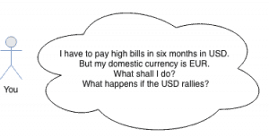
With an FX Option, one party (the option holder) gains the contractual right to buy or sell a fixed amount of currency at a specific rate on a predetermined future date. Upon contract formation, the holder (buyer) has to pay a fee to the seller for acquiring the option. This fee is called the Premium.
We can understand FX Options as commitments; to future transactions in forward contracts and for predetermined prices. What is important is that the buyer of an FX Option has no obligation to exercise his right. Contrary, the seller is bound to the contract if the holder declares to exercise his option.
FX Option Pricing
From the holder’s point of view, an FX Option contract fulfills the same purpose as an insurance policy. The probability of a contractual claim determines the cost of the insurance. This price is usually calculated by using statistical assumptions.
The price of a Forex Option tries to represent the measure of risk. The premium maps two crucial figures, in particular. Firstly, the likelihood that the holder will use his policy in the future, and secondly, the expected loss for the issuing company.
The price of the currency option, the option premium, can be split into two different components, the intrinsic value and the time value.
The intrinsic value is the difference between the current FX spot price and the strike price of the option. We call the excess part of the Premium the time value. It’s the difference between the Premium and the intrinsic value.
Jargon FX Option Trading
| Expression | Description |
|---|---|
| In-The-Money | If an option has intrinsic value, we say that the option is In-The-Money (ITM) |
| Out-Of-The-Money | if an option has no intrinsic value, we say the option is Out-Of-The-Money (OTM) |
| At-The-Money | The strike price and the current spot exchange rate are equal (ATM) |
A currency option will be worthless if it is OTM or ATM on its expiration date. Therefore, the holder will allow the option to expire.
Intrinsic Value
The intrinsic value is the amount of money we could realize through exercising our option, under the assumption that the FX spot rate will equal the current rate on the expiration date. The reason is that the time value will always be zero when the currency option expires.
Hence, a Forex call option has intrinsic value if the FX spot price is above its strike price. A Forex put option has intrinsic value if the FX spot price is below its strike price.
Time Value and Implied Volatility
The calculation of the time value is far more complex. The reason is that many parameters influence the time value. The dominant parameters are the volatility of the underlying currencies and the time left until the expiration.
Higher implied volatility increases the price of the Forex Option because there is an increased chance for profitable movements. Calculating the time value even addresses the difference in the interest rates between the two currencies. Such embedded interest rate differentials in currency trades are called FX swap rates.
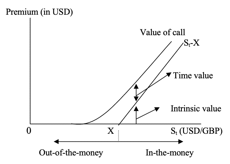
The closer the expiry date gets, the more the time value declines. At the expiration, it is zero. The time value of an option is maximal when the option is At-The-Money. At this moment, the complete Premium equals the time value, and there’s no intrinsic value.
The most common statistical method for European FX options pricing follows the Garman-Kohlhagen model, which calculates a log-normal process. It is a modification of the well-known Black-Scholes Model for standard option pricing and takes the two risk-free interest rates of a currency pair into account.
Why do we use FX Options?
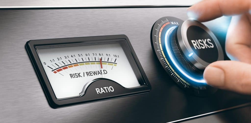
The FX Options market is the options market with the highest depth and liquidity in the World. Market participants can use different strategies for limiting risks and increasing profits.
Traders: Fixing potential risks
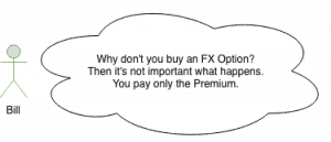
If the FX rate moves against our position in the FX spot market, we have a loss. By acquiring a Forex Option, we can remove the risks of unpredictable losses; our minus will always be limited to the Premium then.
This strategy works like an insurance contract. If the market moves against us, the option protects us by limiting and fixing the potential minus. On the other hand, we can still profit from favorable FX rates should the market move in our direction.
FX options have the advantage that the upside is unlimited. At the same time, we can only lose what we have paid for the contract. Thus, we can develop sophisticated trading strategies. Because you cut your losses and speculate for potentially unlimited wins, you don’t need to win 50% or more of your trades.
Since we know our maximal loss before, position sizing in the spot market can happen with easy and predefined strategies. Another advantage for traders is that they can work without stop-losses for open positions in the spot market. Buy a contract and let the markets decide. Forget about permanently checking your stop-losses, which only leads to mental mistakes – Peace of mind. Interested in more pros and cons? Read our very similar comparison of stocks and options.
Hedging with FX Options
This type of option is also beneficial for hedging FX risk in portfolios when the direction of movements in exchange rates remains uncertain for some time. That’s why Forex Options are handy financial derivatives, especially for portfolio managers.
Currency market turbulence and massive exchange rate fluctuations can happen due to unforeseen events in the World economy or politics. By utilizing FX Options, we can protect ourselves against these sudden movements in exchange rates.
Contrary to the purchaser, the option seller’s risk is potentially unlimited. He will always receive the fixed Premium for taking over the risk. That’s why an option seller needs a considerable amount of liquidity.
FX Option Types
Two different types of options exist per FX pair because of the two underlying currencies.
The purchaser of an FX Call Option has the right to buy the underlying currency. The seller of the Call option has an obligation to sell the underlying currency if the purchaser exercises his right. An FX Put Option gives the purchaser the right to sell the underlying currency. The seller of the Put Option must sell the underlying currency if the purchaser exercises his right.
In all FX transactions, one purchases a currency for another one. Therefore, every single currency pair trades both as a Call and Put.
FX Option Styles
There are different FX options styles which you can classify.
Forex Options may differ in the dates on which we may exercise them. European FX Options may only be exercised on the expiration date and not earlier. American FX Options are more flexibly styled products. We can exercise them at any time until their expiry dates.
Both American and European options belong to the class of Vanilla Options. Vanilla Options include all options for which the payoff is calculated similarly.
The second class is called Exotic Options. Their price calculation is often very challenging and less transparent because they are traded OTC. An example is Binary FX Options. To protect consumers, they are forbidden in many countries.
Forex Option Contracts – Important Terms
Strike Price
The strike price or exercise price is the price at which the option buyer has the right to either buy or sell the underlying currency. The strike price has to be determined in advance and is part of the option contract.
Expiry Date
The expiry date (expiration date) is the last date at which the option may be exercised. After this date, the option contract expires.
Delivery Date
Only relevant if the option is exercised. It’s the date when the currency exchange finally happens.
Premium
The cost of purchasing the FX Option. The buyer has to pay upfront for the Premium, i.e., at the time of purchase. The Premium is calculated based on risk assumptions and depends on different factors. For instance, the difference between the current price and strike price of the underlying FX rate, and the time between the purchase and the expiry are significant.
Exercise
Exercising the option means using the right that has been granted by buying the option. If the buyer decides to exercise the option, then the seller will be informed, and the guaranteed FX transaction will happen.
An Example
A European EUR/USD option could give the holder the right to sell €1,000,000 and buy $1,200,000 on December 01. Here, the agreed strike price is EUR/USD 1.20.
If the exchange rate is lower than 1.20 on December 01, then the holder will exercise the option. If the EUR/USD rate drops to 1.15, then his profit in USD is (1.20 – 1.15) x 1,000,000 = 50,000 if he uses the option. Also, he can buy back EUR in the spot market at a lower exchange rate of 1.15 then.
As you can see, we eliminate the upside risk in EUR/USD by paying the Premium. At the same time, the holder can still profit from a drop in the currency rate.
Where can I trade Forex Options?
Look for a broker that offers FX Options trading. Some brokers provide direct market access to the future and options exchanges such as the CBOE or EUREX. Others offer their own OTC contracts. Additionally, the minimum deposit and fees can be different.
Recap FX Options
What do we do with FX Options?
We obtain the right to buy or sell currency for the strike price on the expiry date.
We have no obligation to exercise this right.
The Premium is the cost we pay.
How does an FX Option work?
The option price consists of intrinsic and time value.
There are FX Call and FX Put Options for both market directions.
American options can be exercised anytime on or before the date of expiration.
European options can only be exercised on the date of expiration.
When and why should I use currency options?
Your risk is limited to the price of the option.
Traders trade market volatility, or they trade without classic stop-loss strategies.
Portfolio managers and businesses hedge Forex risks.